Animating Leaflet Markers (the hacky way)
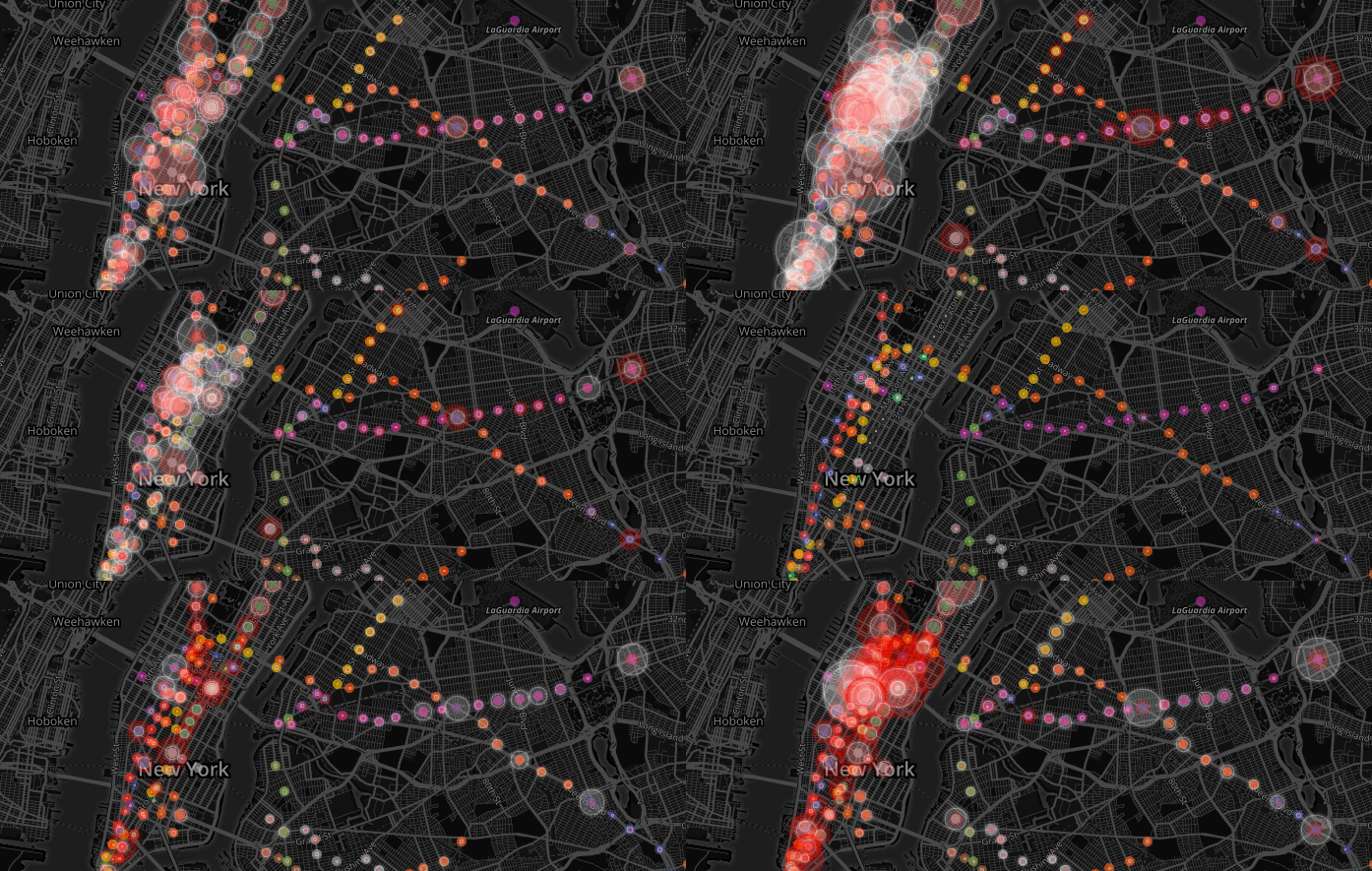
I spent the last two weeks visualizing MTA Subway data – all of the entrances and exits for a week in October 2015. You can see it here and the corresponding repository for the code:

NYC Subway Visualizer Github Repo
Warning: there is yet a README on the repo. I’ll get around to that soon.
This was inspired by Chris Whong’s visualization from sometime back, but built on Leaflet and is interactive so you can filter by lines and get station names and such.
It was a huge project with a whole ton of interesting things learned along the way (see previous posts) – but one of the things that people were interested in were the animations of the red and white circles.
Simple animations on Leaflet
So, spoilers: the circles are actually Leaflet markers.
Leaflet markers were not meant for animations. You create a marker, give it properties (title, color, icon) and add it to the map. You can update it, e.g. move it around, but Leaflet markers don’t come with built in animations. There are a couple of third-party libraries that do animations that work really well if you have predefined animations. For example, fade markers in and out when added or removed with Leaflet.Transitioned.Icon.
However, the map visualization required animations that were not predefined. I won’t know how large a marker will have to be for a particular station until I add it, and I needed to be able to set the size at every time slot. Also, I was being a lazy programmer and didn’t want to write a new Leaflet library for this.
What you need
I used Mapbox for the map – which is a wrapper around Leaflet that has really nice map styling options, but this should work with any vanilla Leaflet map.
An basic understanding of CSS and how Leaflet markers work will also be helpful.
Example and code!
If you just wanna see code, here it is on Codepen. I also explain the steps below. Hover and click on the ‘Rerun’ button to see the animation again.
See the Pen avVNPd by Sher Minn Chong (@piratefsh) on CodePen.
Step 0: Create map
Mapbox has great tutorials for all setup stuff.
L.mapbox.accessToken = <your access token>;
// Create a map in the div #map
var map = L.mapbox.map('map', <your project id>);
Step 1: Create marker icon with L.divIcon
var icon = L.divIcon({
    iconSize: [30, 30],
    iconAnchor: [10, 10],
    popupAnchor: [10, 0],
    shadowSize: [0, 0],
    className: 'animated-icon my-icon-id'
})
Markers have icons. They can be images, which is what the standard marker is. But that wouldn’t work well for animations. Fortunately, Leaflet has this handy thing called divIcons, which allow us to use HTML elements as icons. HTML elements as icons means that we can use CSS transitions and animations on it!
In order to be able to identify which icon it is, we’ll add a class (or id) unique to the divIcon. Here, it is my-icon-id. We are also giving it an initial size of 30px.
Step 2: Style yo’ icon
I made it white, with glowy edges. The magic happens with the transition property. Read more about transitions here and why they are magic. It basically means: if my element changes in any way, make it transition the way you know how! That’s how the smooth animation thing happens when the size of the marker changes. In your CSS:
.animated-icon{
  width: 20px;
  height: 20px;
  background-color: rgba(255,255,255,0.5);
  border-radius: 50%;
  box-shadow: 0px 0px 4px white;
  transition: all 1s
}
Note a slight disadvantage here – you have to define the animation time, though you could set this programmatically with JS later.
Step 2: Create marker with divIcon and add to map
//marker latlng
var ll = L.latLng(40.795, -73.953)

// create marker
var marker = L.marker(ll, {
  icon: icon,
  title: 'look at me!'
})

marker.addTo(map)
You should now see a marker on the map!
Step 3: Play around with marker’s divIcon!
I’m going to make it grow into a square, then shrink, then grow again!
marker.on('add', function(){
  var myIcon = document.querySelector('.my-icon')
  setTimeout(function(){
    myIcon.style.width = '50px'
    myIcon.style.height = '50px'
    myIcon.style.marginLeft = '-25px'
    myIcon.style.marginTop = '-25px'
  }, 1000)

  setTimeout(function(){
    myIcon.style.borderRadius = '10%'
    myIcon.style.backgroundColor = 'skyblue'
  }, 2000)

  setTimeout(function(){
    myIcon.style.width = '30px'
    myIcon.style.height = '30px'
    myIcon.style.borderRadius = '50%'
    myIcon.style.marginLeft = '-15px'
    myIcon.style.marginTop = '-15px'
})
Note the hacky margin-left and margin-top stuff to make sure the icon stays centered. You can style it however you like and the CSS transition should take care of it.
And that’s it! It took a bit of tinkering to figure this out, and I hope this helps someone!