Subway Turnstile Charts!
I have pretty charts! Courtesy of Plotly, which Kristin recommended. Paired with Miriam on learning how to create simple charts with it, which was super productive. It is sooo easy and so good to use. Would totally recommend for quick and pain-free graphs.
Working with Plotly
Plotly has a Python wrapper that generates a chart for you. It’s a wrapper around D3, so you don’t have to mess around with D3 directly. You do need an account to use Plotly, and all of your charts will be public unless you give them money for a paid account.
Given some data, it’ll generate an interactive chart and do nice things like autoscaling. It’ll spit out an url to your chart online, which you can embed as shown below. It falls back on a static image if the chart fails to load, which is pretty awesome. They also have tons of very simple examples of different chart creations.
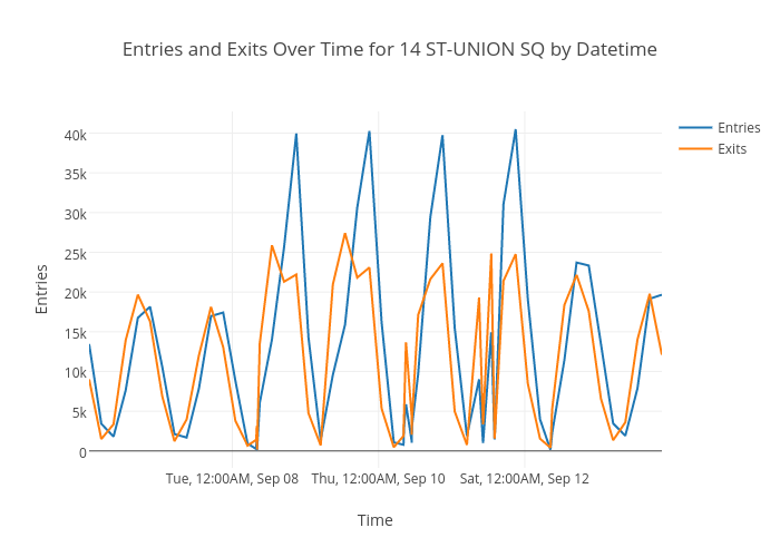
Also, another awesome feature: try selecting just a part of the chart (e.g. one day)! It’ll zoom in to that selection!
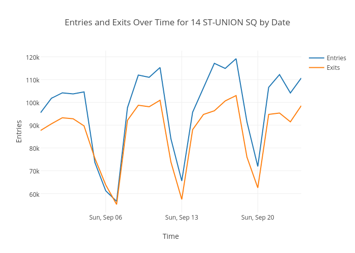
An initial observation
Take these with a grain of salt since this is just for a month of data and for one station. Aparently more working people take the subway than tourists – note the very prominent drops in traffic on weekends. There are also strange dips on Thursdays – people working from home towards the end of the week perhaps? And it seems that Fridays are popular days to be on the subway.
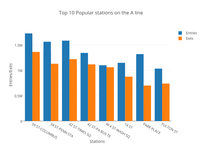
Also, for the sake of formality, the top 10 most popular stations on a chart:
What’s next
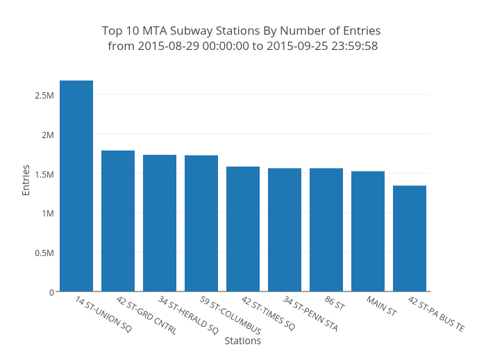
Heatmaps! I finally have a larger data set of 3 months from Jun 2015 to Aug 2015 (which took a few hours to process and clean today) and am gonna see how it matches up with the preliminary data!